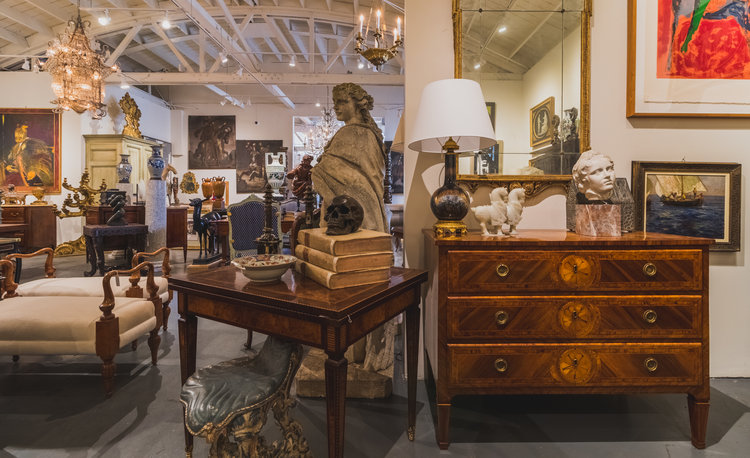
Antonio’s Bella Casa is an enormous showroom, specializing in antique furniture and artwork, although they do have plenty of Contemporary artwork, as well. Kevin, the assistant, was there to answer all of my questions about the antique market, and even some Interior Design advice. Tony, the owner, had a few thoughts he wanted to add during our email conversation, so I’ve added them so you can hear from the master himself. Enjoy this rare glimpse into their world!
Eric: Could you tell me a little bit about the history of La Bella Casa?
Kevin: Sure! Tony is the owner, and he has been in business for 23 years, now. He opened the shop in Newport first so that’s where he began: from a tiny little place, he expanded to both sides. Then he started going to Italy and bringing things back. Prior to that, his mom and he ran a consignment shop together, and then he went off on his own and really started a full-fledged business.
He opened a space on Melrose Place for a little while, which was sort of like a pop-up. He then opened a spot right down the street from here. That’s where I started in 2009, and I’ve been working here ever since. We were there for a couple years and then moved into this spot on La Cienega. So we were able to take over this space and that’s really great, because I think this is definitely much more of what Tony really wanted. He wanted a big, sort of industrial, space that really shows the pieces well: almost like a gallery.
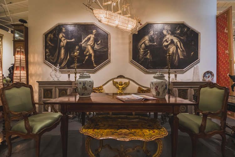
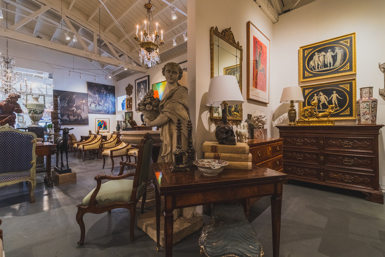
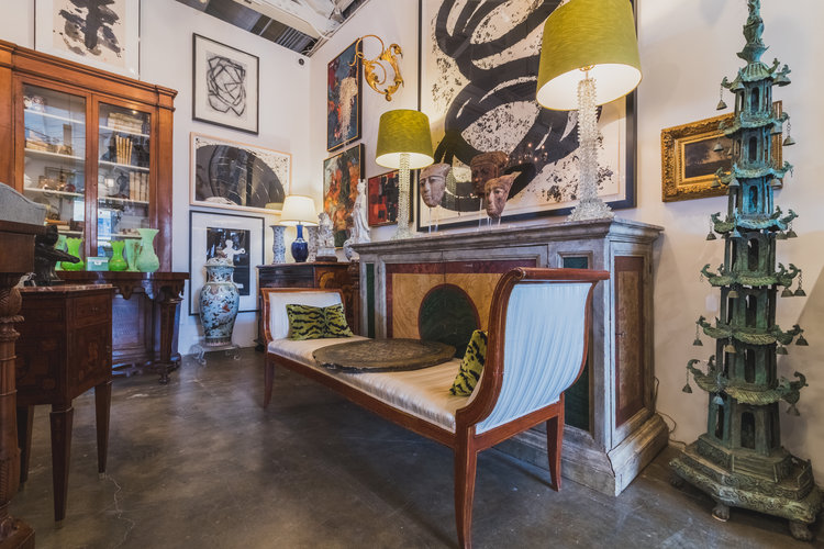
Tony’s style is definitely not like other people! Hardly anyone does this level of sophistication, between pairing these older pieces, (sometimes ancient pieces), and then mixing it with a great deal of Contemporary Art and Post-War Contemporary, so you’ve got everything from a painting made in 2017 to this giant 18th Century piece sitting there in the back, to these pair of 18th Century Grisailles. Most people don’t do that, because most antique dealers stay away from anything contemporary at all.
Eric: What’s the secret to mixing the Contemporary with the Traditional?
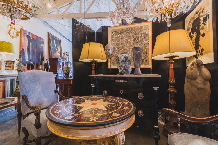
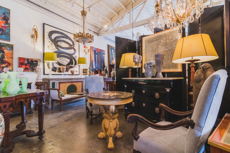
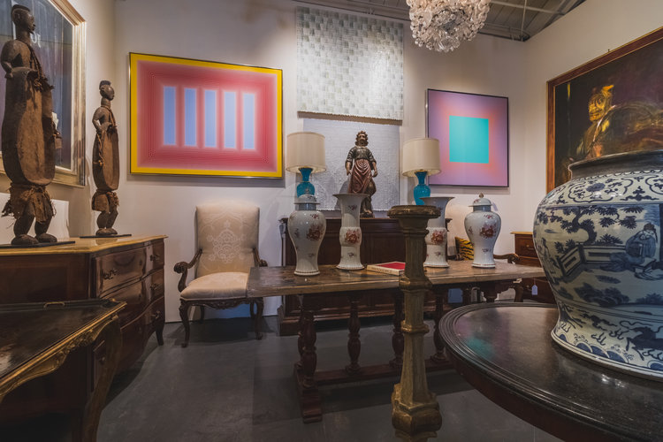
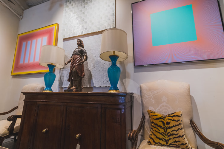
Kevin: You know, it’s a good question, and there may not be one single answer for it. It depends on what you want. Is it a color thing? Here: [pictured above] these two on the sides are from the 1980s and 90s, the sculpture in the middle is from the 1700s, the lamps are turn of the century, and the buffet underneath it is about 19th century. Why does this work? Well, I think it works because simple shapes and high quality are easy to look at. It has clean simple shapes, beautiful colors, but it isn’t really fussy. While the white texture is kind of quiet, it stands out differently, and then other pieces bring in the colors.
So, you don’t have to do this, but that’s why this, in particular, works. You could do it completely differently. You could do something like this: [pictured below] something that’s completely underneath that was black, that’s very sexy, but it’s all kind of muted. None of this is crazy-looking, and then you could pop it with a sham in here.
There are a lot of ways to do it, but to me, if you want quality, then buy high-quality, and you only cry once. People have to not be afraid to be somewhat expressive in what they do, and if you do it with interesting high-quality stuff, it’s probably going to work!
Of course, I deal with interior designers so all of this is a suggestion. It’s laid out to be attractive, and to be interesting, but it doesn’t mean we’ll do exactly this. But it gives them a way to look at it, and I think when you mix the art with something like a 19th Century Second Empire piece, it gives a chance for all the pieces to stand out. Then they all get to occupy their own space.
Eric: What would be your ideal entryway to a house?
Kevin: I wish Tony was here because he’s really good at that! I think, you know, it depends on the house and the space, but it would be great to have some crunchy old stone or marble pieces. Maybe with an older table, but a really contemporary flower arrangement on something really modern, or a really modern sculpture on there to offset it. And then a chandelier that is older, but maybe a little different: something that is not the same, so you’re getting different textures, you’re getting some sparkle, you’re getting some age, you’re getting something that’s modern! It would also be great if you had a painting in that space, a true entry should have a painting!
Tony: I always tell my client it must be a statement not a throw away! It is the first and last thing people see upon entering their home and it sets the tone for the entire experience. All the elements must come together and give a wow factor.
When a client is shopping specifically for their bedroom, again I will try to gleam as much information from them on what it is they like. Be it my own design, client or a customer, I want to understand their full vision, and then push them to buy the things that make them most happy, the most excited, the most proud: your bedroom is the first and last thing THEY, the owner sees, it sets the mood for the day and night, it will make their daily mood better, this is important!
Eric: What’s something that the average person could do to step up their game a little bit on their own?
Kevin: Hmm, I think I am a big texture person, and color is obviously extremely important, but most people don’t handle a lot of color well and are a little frightened by it. So the average person is probably not going to want to be experimenting with bright colors, (which can work amazingly, but it can be harder to manage). I think the average person could step it up by bringing things into the home that have a lot of character. Things that have a lot of texture in them, because those immediately become a point of interest, but aren’t very distracting. They tend to be easy to live with. I also think that bringing indoors things that have lived outdoors, is really interesting, especially with their patina and character. Bringing that inside is interesting, because it just adds something so soulful to dress space.
Eric: I haven’t heard that before, that’s a good idea. How has the antique industry changed since you’ve been here?
Kevin: I know it’s about nine years for me, so I think the major changes happened before I was involved. Basically, there was a massive fall off an interest: everyone wanted only contemporary! But there were always people, especially at the very high end, who are more sophisticated, who’d want some of our pieces. We have always done well, but we also have had a lot of absolutely exceptional art work, so I have clients who are ‘artwork only’, that has also been helpful because it’s diverse. However, it’s all coming back around: the funny thing that I’m seeing now is that all of the major magazines are including traditional pieces. Even Lux Magazine which, at least since I’ve been looking at it nine years now, has never done anything but contemporary. So, it’s coming back again because people are not necessarily wanting to live in these sterile environments, that looks like everyone else’s and has just become dull.
Tony: I don’t think there is a massive fall off, but they did fall from the style of the day. They have never gone out of style. Styles change, style doesn’t. And antiques have always found a home in Classic Style.
Eric: Are there any last things you want to say to the people out there?
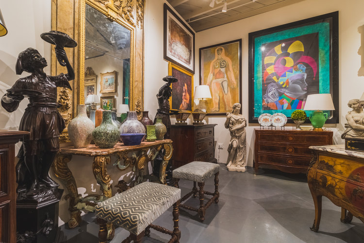
Kevin: Buy more antiques! Make your homes someplace that is interesting for you and that is really expressive of who you are! But don’t limit yourself: challenge yourself by looking at things that are different, challenge yourself by looking at things outside your wheelhouse, and start looking at magazines. Especially right now, because they’re showing Transitional Interiors, and see why it works. See why mixing it up makes sense. Don’t live your life at Restoration Hardware, you know that doesn’t do anything for anybody, and, you know, I think that you can have a lot more freedom and latitude, and will surprise yourself by looking at this!
The last thing I will say is a bit of advice from my boss, which he’s given to many people, and I think it’s a fabulous truism that is right for everybody when buying artwork or anything else: For something that you really love, put it where you see it every day. Don’t hide the thing you love, because you’re the one living in the house, and you should get up and see the thing that you love every day!
Tony: Buy what you love, don’t be beholden to trends. Again styles change, style never has! Always buy something that excites you, push yourself as a collector, and imagine yourself in the space you love! If you do not know how to get there alone, definitely hire a designer. Life is brief, live with lovely things, you will never regret a beautiful antique chest of drawers or a painting that evokes an emotion, they will be treasures all your life.
To read more of our design content, please visit our Journal Page.