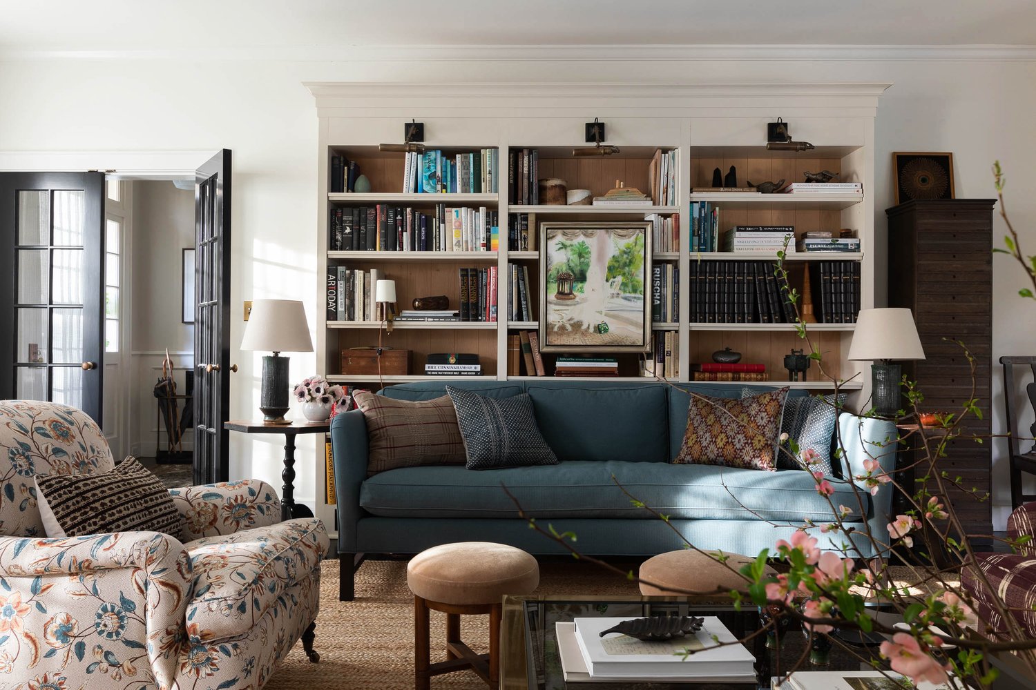
With so many options from materials to colors and textures, here we break down some of the design elements that are both classic and trendy for 2022. You will learn how to implement these elements with confidence, so your interiors can reflect your most authentic self.
Recurrent Shapes of Tables and Chairs
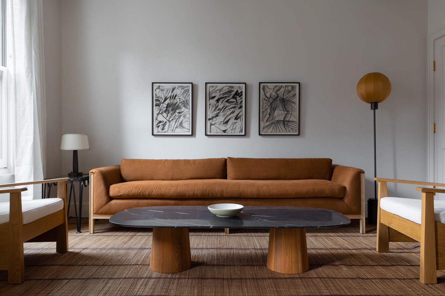
As a luxury interior design studio, when designing a living room, dining room, or kitchen for our projects in 2022, we like to implement a mix of these shapes: round; oval; square; and rectangular. Round shapes are in demand this season because they make rooms look smaller. Oval shapes add drama to any space while being extremely versatile. Rectangular pieces are well-rounded with clean lines that work well with modern design aesthetics. Square tables provide stability and strength while being altogether sleek and chic—they give a room an edgy feel without being overpowering or clunky (like hexagons). Finally, wood furniture will dominate the market this year as metal takes a backseat due to its unavailability and high cost of production. Wood gets its fair share of attention too because it can be stained or painted in any color imaginable without losing its appeal over time like other materials would do when exposed to harsh weather conditions outdoors or hot steamy water during cleaning inside your home bathroom sink basin area.
Metallics are Back with a Vengeance
We’ve seen a lot of metallics in 2022 in small and large ways. Metals have always added an element of luxury to any space, but now they’re being used on walls, floors, furniture, and accessories—even tableware. Walls: Think gold leaf wallpaper or metallic paint. It can go anywhere you want to make your room look fancier than it is. Floors: In the past few years we’ve seen lots of marble tiles (which are still around) as well as shiny glass tiles that look like metal sheeting laid over the flooring material.
This year though? I think we may see more wood planks with a metallic finish on top of them instead; they don’t cost much more than regular wood so maybe homeowners won’t be worried about getting splinters anymore either. Furniture: We have seen some crazy stuff from designers this year like tables made out of metal pieces or lamps with legs made entirely out of some kind of steel tubing…but now those ideas are becoming mainstream too because everyone wants something unique about their home decor without breaking their budget. A good example would be having some sort of metal frame holding up each leg so even though chairs might not look like anything special at first glance….but wait until someone touches them! You’ll get surprised when those legs turn into something else entirely. Kelly Wearstler’s closet is definitely one of the most stunning spaces that showcases metallic in its full maximalist interior.
Natural Materials
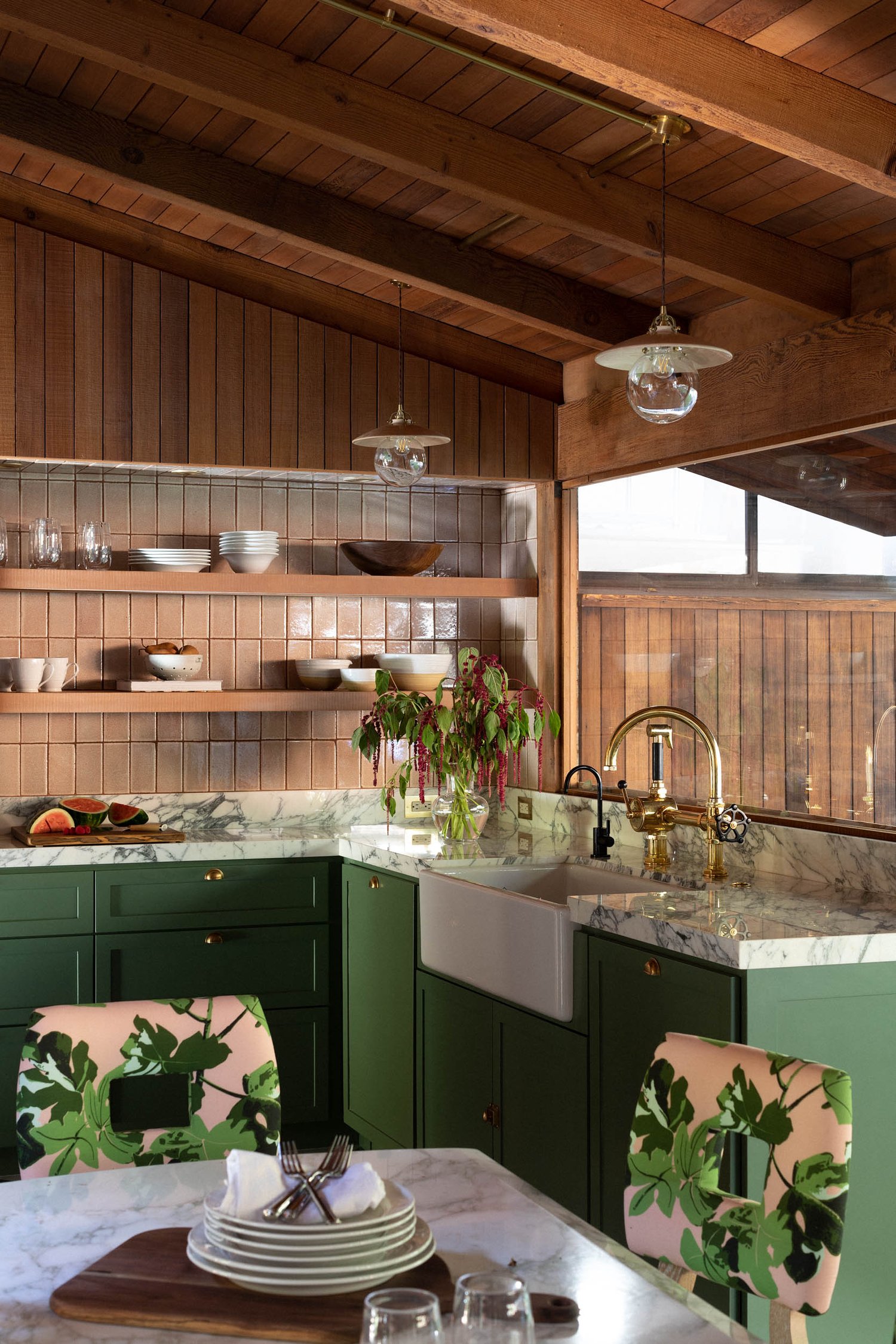
You may have heard that natural materials are back in style this year. That’s true! Here are a few reasons why: they’re sustainable, which means they don’t require a lot of energy or resources to make and can be recycled easily. They’re durable and won’t scratch easily, so they’ll last you a long time. If something does scratch them (which can happen), you can usually just sand it down and repaint it without much hassle. You can find some natural materials like wood in many different shapes and sizes—you’ll never run out of options when decorating with these options. Some of the spaces we love are the design of Green River Project & Bode, and Rand & Company. We love Emily Bode and Aaron Aujla’s rustic kitchen, inspired by the one at Bode’s family home on Cape Cod, that is cladded in coffee-stained Douglas fir.
Minimalism
This year, we’ve seen minimalism hit its peak. Minimalism is a design trend that focuses on the use of clean lines and simple shapes, which helps create an airy feel. It’s also known for its focus on space: empty rooms are filled with neutral furniture and little else—it’s all about what you need versus what you want. Minimalist interiors generally feature white walls (which can be painted any color), hardwood floors (or marble) with few or no rugs, lots of natural light from large windows (or skylights), and lighting that emphasizes shadows instead of brightness. Other common elements include neutral-color fabrics in upholstery or curtains; wood tables; sleek metal lamps; large mirrors; natural textures like stone or wood accents; low-backed sofas without armrests (so there’s plenty of room to lounge); lots of plants for air purification benefits. In this Luxembourg family residence designed by Richard Meier, the living room features furniture by Minotti and an arched floor lamp by architect Shigeru Ban for FontanaArte. Here is another space we love is this Dallas home designed by architects Tod Williams and Billie Tsien, the dining room features a John Pawson table and Hans Wegner chairs.
Low-key Feminine Colors
If you’re looking for a low-key feminine color scheme, consider a combination of reds, oranges, and blues with green. The presence of these colors will be tempered by yellow and gold. A cream or brown may also be added to this combination of colors. In addition to these suggestions, it is also important that you take into account how many lights are in your room before selecting your palette as this will help determine how much light will bounce off the walls when they are illuminated by lamps or overhead lighting fixtures.
Cozy Bedrooms
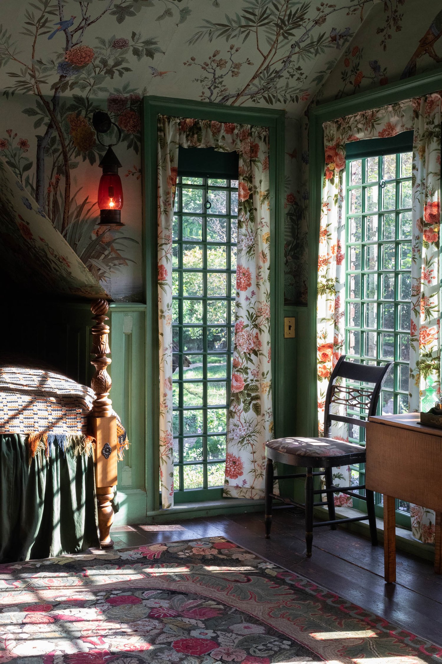
Cozy bedrooms can be achieved by incorporating cozy colors like brown, green, and yellow. Textiles like cotton and wool will also help to create a warm ambiance. Natural materials like wood and stone are also used in creating these types of spaces. Warm lighting will help to create an inviting atmosphere for your guests to relax in as well as help them feel more comfortable in the space that you have created for them. Cozy bedrooms should include soft textures such as velvet, suede, or leather which all add texture to any room without being overpowering, especially if you choose one material per piece of furniture rather than using multiple fabrics on each piece (which could look cluttered).
Sacred Geometry
Sacred geometry is the use of geometric shapes, patterns, and proportions in architecture and design. The term ‘sacred geometry’ was coined by French architect Charles Lhuillier and refers to the basic mathematical rules which we see as divinely inspired, discovered through observation of nature. The ancient Greeks and Egyptians used sacred geometry when designing temples, buildings, sculptures, and playing cards. The purpose of this was to convey universal laws or truths that connect everything in creation.
Fewer Screens, More Books
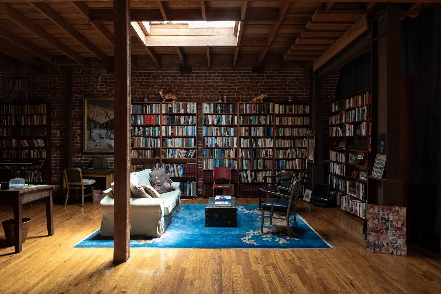
In luxury interior design, you want fewer screens and more books. Books are a great way to bring the outside in and create a cozy atmosphere. They can also be used for decorating and creating personal spaces, like our reading nook. Here is the library-dining room in textile designer Carolina Irving’s Paris home.
Mixing styles Over nailing one trend.
In the past, we’ve seen trends come and go, with designers following them like sheep. While it is okay to be inspired by what other people are doing in the design world, you should always try to add your own twist to it. This way, your design will stand out from the masses and become unique – something that end users would love. Mixing styles in one look rather than nailing one trend and going full throttle with it is a good way to do so because it makes things interesting while still maintaining some kind of cohesion. For example, you can mix modern furniture with traditional pieces like a chandelier or art deco-style mirror frames on an industrial light fixture; or combine mid century modern chairs with minimalist lighting fixtures for a striking effect. The possibilities are endless here; I encourage you not only as an interior designer but also as an individual consumer who loves decorating their home. Here is one of our designer’s favorites, Billy Cotton’s living room space .Billy Cotton’s work is deft and light, weaving together bold color palettes, custom-designed furniture and lighting, and striking artifacts and works of art to achieve livable and easy interiors.
Photography by Jess Isaac.
To read more of our design content, please visit our Journal Page.